GOODREADS APP
REDESIGN OF THE GOODREADS APP
Project Details
Client:
Goodreads
Date:
16 June 2024
Category:
Concepting, UI Design
The Challenge
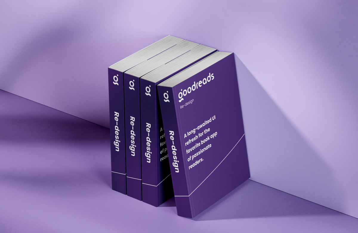
As an avid reader and frequent user of the Goodreads app, I realized that while the platform serves its purpose well, several design choices felt outdated and didn’t align with modern UI and visual design trends. Motivated by both my passion for reading and a desire to further hone my Figma skills, I decided to take on a self-initiated challenge to redesign some of the app’s wireframes.
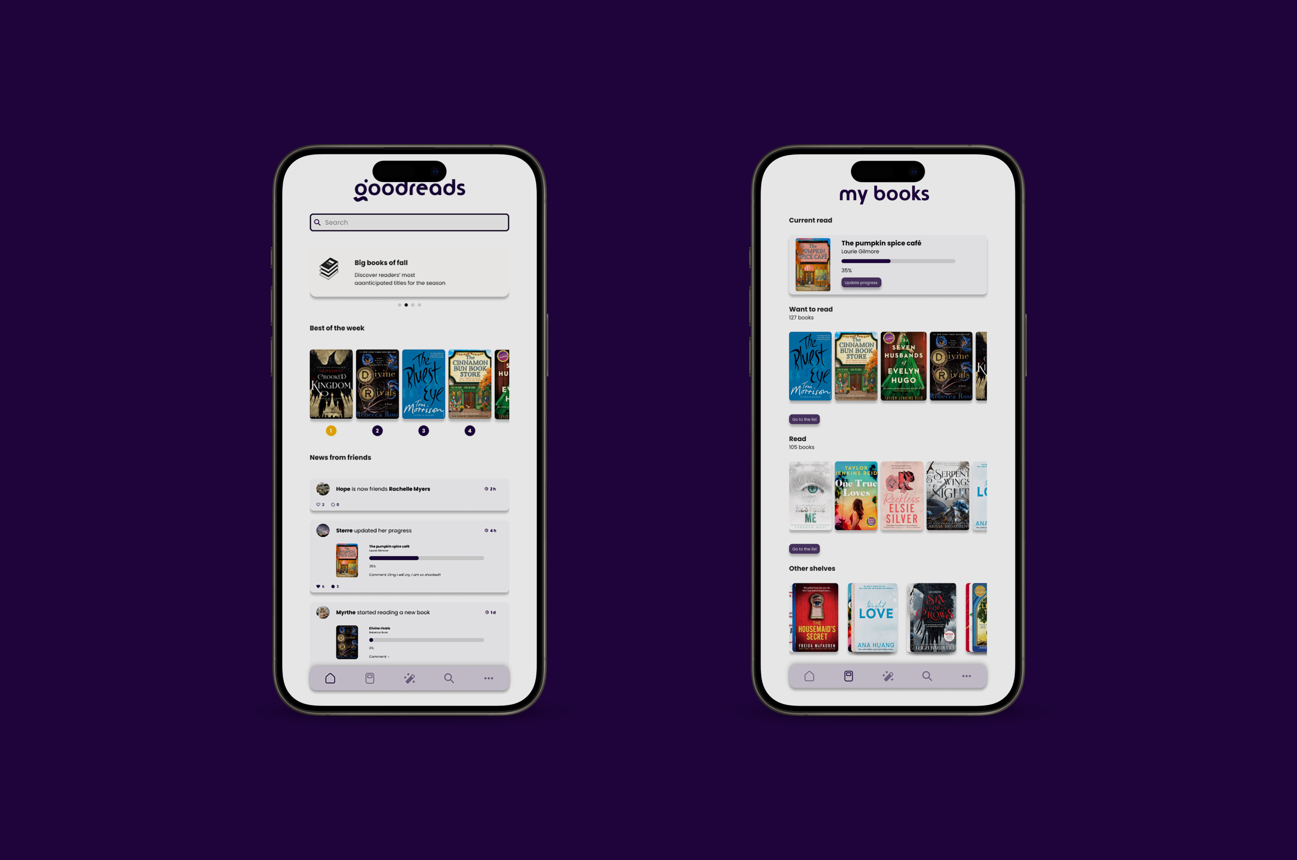
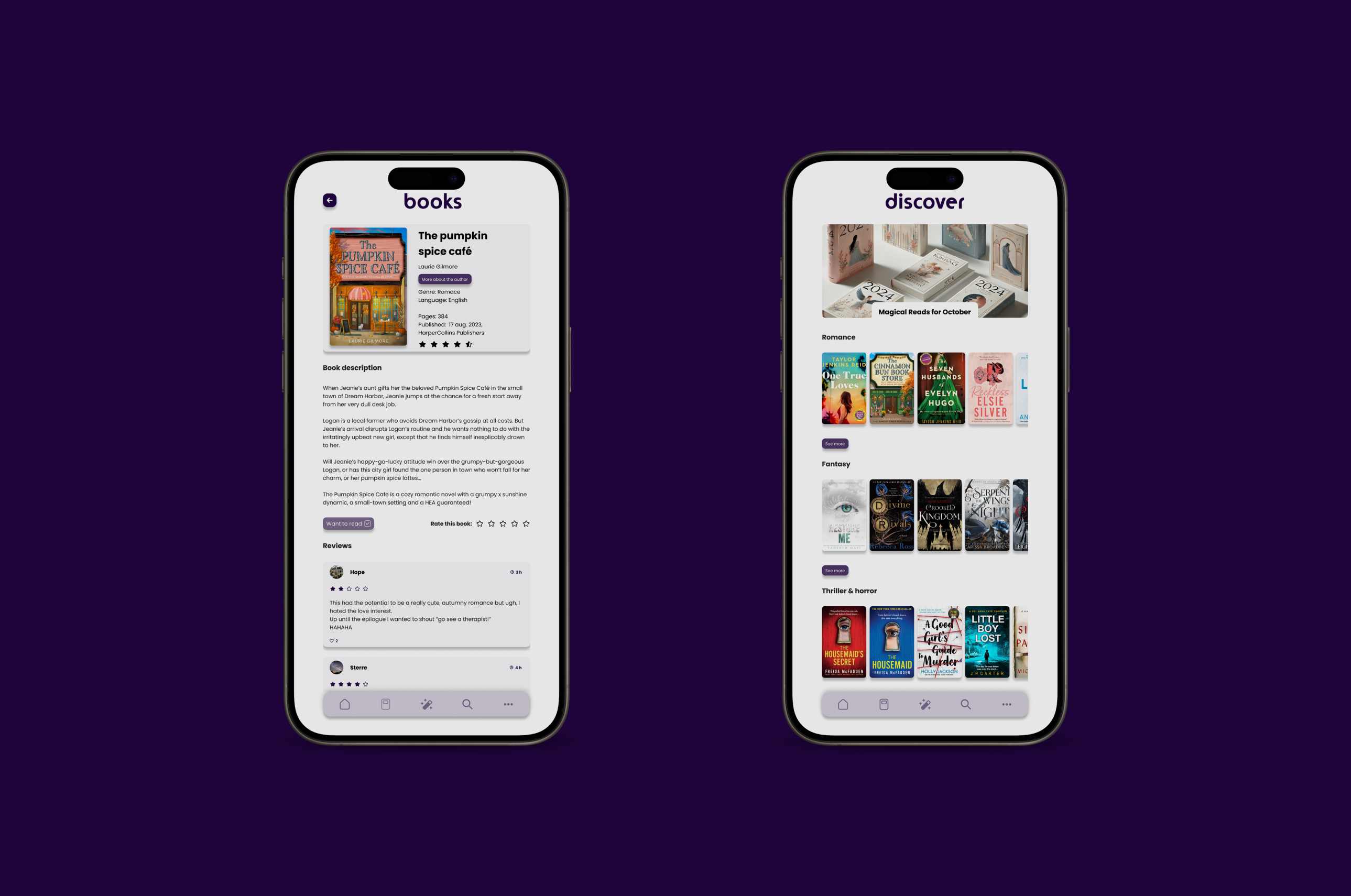
My approach was twofold: update the user interface for a cleaner, more modern look and experiment with a completely new visual direction. I took the opportunity to design a new logo and implemented a fresh color scheme. To push my skills further, I limited myself to a minimal color palette, playing with opacity to introduce subtle variations while maintaining a cohesive and elegant look. This was a deliberate choice to create a minimal, yet playful and powerful design.
Results
The final result was a sleek, modernized version of the Goodreads app, with a cleaner UI that was more in line with current design standards. The new logo and limited color scheme brought a more cohesive and sophisticated feel to the app. By embracing a minimalist approach, I managed to create a design that felt both functional and playful, without overwhelming the user. Additionally, the use of opacity and subtle transitions added depth to the design, enhancing the user experience while maintaining simplicity.
My Role
This project allowed me to strengthen my Figma skills and pushed me to think creatively within constraints. By limiting the color palette and experimenting with opacity, I learned how to add layers of complexity to a design without introducing unnecessary elements. I also gained valuable experience in balancing aesthetics with functionality, ensuring that the redesign was not only visually appealing but also improved the overall user experience.
This project reinforced the importance of following UI and design trends while ensuring that the design remains intuitive and user-centric. Through this self-initiated challenge, I was able to take creative risks, refine my design process, and produce a more modern, cohesive version of an app that I use and love.
