PICNIC SCAN APP
ADD-ON FUNCTION FOR PICNIC APP

Project Details
Client:
Club Leaf and Icemobile
Date:
2 September 2022
Category:
Concepting, UX/UI Design, UX Research
The Challenge
The task of this project was delivered to us by the clients Club Leaf and Icemobile. These are two separate companies that both focus on global climate change. Club Leaf and Icemobile asked us to come up with a concept that will help customers of the chosen supermarket make better, more sustainable choices. The supermarket that our team chose was Picnic.
The target audience we got to work with were working parents with elementary school-aged children. During our interviews, we discovered that our target audience wants to spend more time with their children, but due to working full-time, they have limited time for this. Based on all the research and interviews, our design question became: "How can we reduce food waste in a fun and easy way by involving families?"


Results
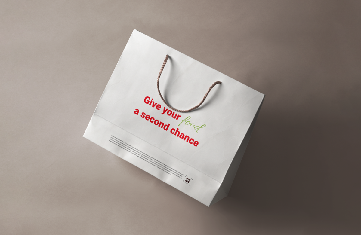
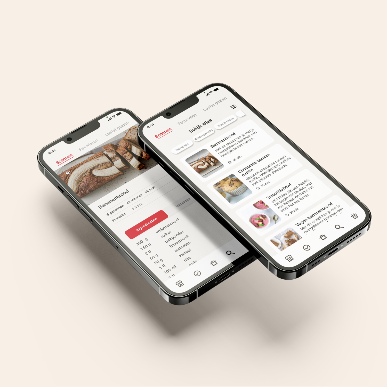
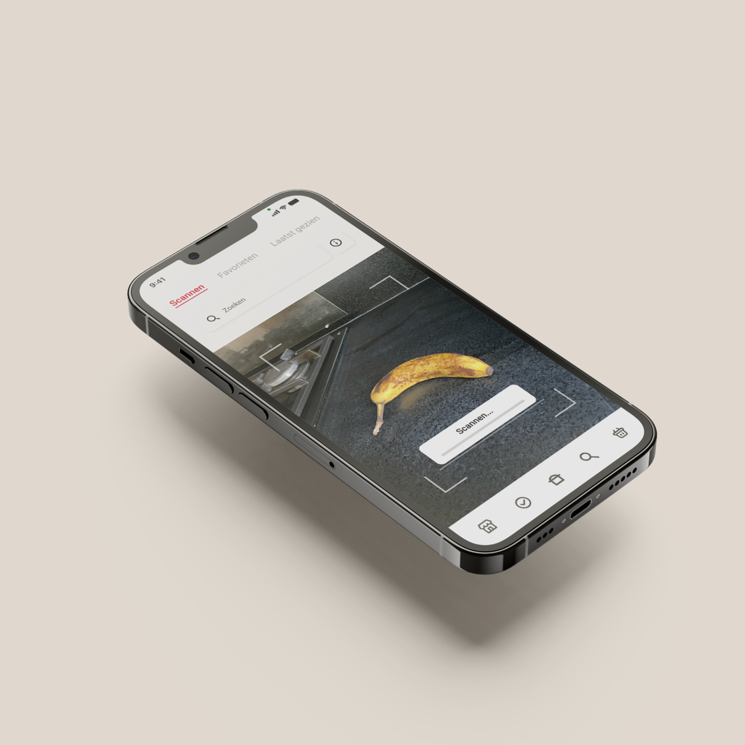
Ultimately, we came up with the concept called Picnic Scan: "Give your leftover food a second chance. Scan the products and fight food waste!". When you have products that are near or past their expiration date and don't know what to do with them, you can open the Picnic Scan feature in the Picnic app and scan your products. The Picnic Scan will then show what you can still do with the product in a clear list. The app also gives you the option to find different ways to use the product, whether it be through a recipe or an activity or a tip to keep it longer. By scanning the product, you give it a second chance and prevent it from being thrown away.
My Role
In this project, I served as the team captain, and I gained a great deal from the experience. I learned not only how to effectively manage a team—ensuring that everyone’s ideas were heard, considered, and that each person had a meaningful role—but also how to motivate team members to reach their full potential. For example, one team member was struggling with personal challenges during the project. I prioritized creating a safe and supportive environment for her, which encouraged her to open up and share her difficulties with us. As a leader, I learned the importance of patience, empathy, and fostering trust within the team, making sure everyone felt secure and valued.
This approach led to stronger communication and a deeper understanding of each other’s strengths and limits. As a result, we worked more cohesively as a team, which not only improved morale but also contributed to the overall quality of the final product. Our design was more harmonious, well-connected, and smoothly executed because we understood how to leverage each team member’s abilities while supporting their needs.